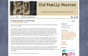
I prettied up the design of this blog last week, both as an exercise in my design skills and to make it easier on the eyes—though I’ll undoubtedly continue to tweak some minor things over time. The important thing is that I’m ready to share my family history blog!
Since there’s a fair amount of red/green color blindness on my mother’s side of the family, I stuck to blues and orange/browns so that it looks similar to most people. Photoshop allows me to verify that with its deuteranopia emulator view, which I think is a really cool and useful feature.
You may have noticed some sponsored links on the sidebar. I’m not under any delusions that I will make a profit from this family history blog, but if you click a link and make a purchase, then I will receive a small affiliate commission that will go toward my web hosting fees and, if any is leftover, to archival supplies. (I referred to receiving a big shipment of archival boxes in my last post, and am excited to share some photos tomorrow.) You’re also welcome to enjoy my blog without ever clicking a sponsored link. Contribute two cents when you can in the form of a comment. 🙂
With this blog, I’m really hoping to engage my extended family in our shared stories and mysteries, connect with relatives I don’t know or didn’t know I had, and maybe even interest a few fellow family history bloggers and archivists. At the very least, I’m recording my discoveries and progress in a searchable format.
For those interested in my blog design from a technical standpoint, I use WordPress (self-hosted) and created a child theme based on the popular twentyten theme. I enjoy playing with CSS and Photoshop when I’m not organizing genealogy files and sleuthing for old family stories! My favorite web design advance in recent years is the ability to employ custom font faces on a website without using images. The typewriter-style font you see on this website is Special Elite, a font that is free for commercial use from Font Squirrel. [Edit: It’s rendering with a fake bold on Firefox and IE, so it looks funny right now in those browsers. I’m working on a hack to fix it.]
For the background, I considered several styles from this collection of vintage patterns and textures until settling on one from this free pattern pack. I adjusted the color and scale in Photoshop to be what you now see in the background—hopefully adding subtle character without being distracting. Though I’m not in love with the actual pattern, I can play with that some other time. The color overlay was the most important because I wanted a certain shade of grayish blue that would coordinate with not-yet-visited text links.
I made the header image from scratch in Photoshop using a portion of one of my favorite photos (further explained here) and a digital texture I created over the summer from the scan of an old pillowcase with a tight cotton weave. If you look closely at the typewriter-styled “Old Family Stories” font you will see that it has a slight shadow. That is part of the background image itself while the black text, along with the subheading, are pulled in dynamically and positioned with CSS.
I hope you enjoy my dedication to overthinking as much as I do; a proper sleuth* considers everything from all angles.
*I should note that my ideas of proper sleuthing were formed in childhood under the influence of the following fictional detective role models: Inch High Private Eye, Danger Mouse, Maxwell Smart from Get Smart, Penny from Inspector Gadget, Velma Dinkley from Scooby Doo, and the book version of Encyclopedia Brown, Boy Detective. Curiously, I was never drawn to Nancy Drew.


